

Paint Consultation
Helping Homeowners in North Vancouver Pick the Best Paint Colors for their Home
Not sure which paint colors to select for your interior?—no worries, Go To Your Room has got you “colored!”
Learn more below.
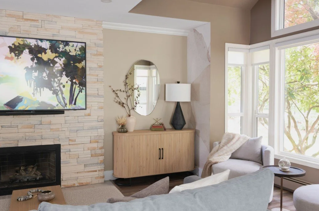
This earthy-vibed living room draws you in to the relaxed space by using the calm SW 7530 Barcelona Beige combined with a stronger SW 2855 Sycamore Tan in the bay window alcove in order to give the space some variety of color. Both are neutral colors and help to ground the sand-colored wallpaper that has pinkish hues throughout.
Our Process
Duration
Up to 2 hours
How It Works
At your home, during daylight hours, we will bring a variety of tools to help narrow down appropriate color options for your already well appointed space.
Our Focus
We will assess your furnishings & layout and make recommendations of neutral or colorful paint options that will enhance your home immensely.
The Goal
To leave homeowners with clarity on paint options that will work in their room and provide them with a paint schedule summarizing selections.
The Proposal
Homeowners may paint the space themselves or they may request a proposal from GTYR to complete the painting project.
Paint Consultation
Based on a 2-room minimum $350+GST for consultation and follow up paint schedule summarizing colors, room location & sheen.
A New, Warm and Modern Neutral Paint Color
Sherwin William’s
SW 0079 Pinky Beige
Although these homeowners loved the cheerful yellow running throughout their newly purchased 1990’s home, they felt that perhaps the vibrancy would overwhelm their main floor entry and living room, so they opted to keep it to just one room.
They requested the paint consultation service from Go To Your Room to help them find a color for their main floor living, that was other than grey or white, but would still update the space with a current and modern feeling.
Working with this home owner request alongside what was staying (flooring and tile), we narrowed down the selection to Pinky Beige combined with the warm Panda White with a warm undertone.
AFTER: Sherwin William’s SW 0079 Pinky Beige


HIGH ABOVE: Sherwin William’s SW 6147 Panda White

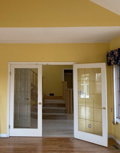
BEFORE: Bright yellow and white living room with carpeted staircase
Modern Violet Blue Kitchen
Sherwin William’s
SW 6242 Bracing Blue
This homeowner knew they wanted more than all white cabinetry and after discussing their preferences through a color consultation in their North Vancouver home, Go To Your Room helped narrow down the multitude of grey/blue colors to help with the final selection process.
Knowing that most of their home was going to consist of the calming, pale neutral greys and white oak, (and not to mention living in one of the rainiest and darkest rain forests of British Columbia!), Go To Your Room helped narrow down the blue selection and the homeowners ultimately opted for Sherwin William’s cheerful SW 6242 Bracing Blue—a modern, crisp contrast to the traditional white cabinetry and coordinate with the grey veining in quartz counter and backsplash selections.
White will always be classic, but ALL white cabinetry was popular 10 years ago and this young family was looking for something more future focused. They chose to embrace color with an upbeat feel and are thrilled with their new, cheerful kitchen vibe.


Blue Power Suit
for the Win
Sherwin William’s
SW 7076 Cyberspace
A year after completing a significant interior home renovation, this client was finally ready to tackle the exterior. Torn between a few favorite colors and looking for something new and exciting, this client was ready for a change...
And change is what they got! After a tour of the newly appointed sleek interior, reminiscent of a power suit, it occurred to us that this top executive's home would be best "suited" (pun intended) to Sherwin William's bold and sophisticated SW 7076 Cyberspace.
After Photo:
Painted in SW 7076 Cyberspace

Before: Craftsman home with natural shingles paint color


Color is a power
which directly influences
the soul.
Wassily Kandinsky, Artist